Obviously there are many factors that could complicate the calculation of this “replacement number”. An increase in war and pestilence would tend to raise it, since more births would be necessary in order to make up for an increased death rate. In the opposite direction, improved medical care and decades of peace would tend to reduce the replacement number.
But what governs the increase or decrease in a country’s population in any given year is the number of births compared with the number of deaths.
This morning I stumbled upon a table at Infoplease which shows the birth and death rates per 1,000 population for various countries, most of them European. To determine the rate of increase or decrease, I used the following method to calculate a ratio between the population at the beginning of the year and that at the end:
(Start population of 1,000 + number of births - number of deaths) ÷ 1000, then subtract 1.
A positive ratio indicates that the population is increasing, and a negative one that it is decreasing.
For example, for Australia in 1975 the birth rate was 16.9 per 1,000, and the death rate was 7.9 per 1,000, yielding the following calculations:
1000 + 16.9 — 7.9 = 1009
1009 ÷ 1000 = 1.009
Subtract 1 and you have a ratio of .009, which is the rate of increase.
In contrast, consider Japan in 2007, with 9.2 and 9.4 respectively:
1000 + 9.2 — 9.4 = 999.8
999.8/1000 = .9998
Subtract 1 and you have a ratio of -.0002, which is a slight decrease in population.
Using these methods I built a trend for each country. This is example is for Australia:
| Year | Births | Deaths | Ratio | |||
| 1975 | 16.9 | 7.9 | 0.0090 | |||
| 1980 | 15.3 | 7.4 | 0.0079 | |||
| 1985 | 15.7 | 7.5 | 0.0082 | |||
| 1990 | 15.4 | 7.0 | 0.0084 | |||
| 2005 | 12.3 | 7.4 | 0.0049 | |||
| 2006 | 12.1 | 7.5 | 0.0046 | |||
| 2007 | 12.0 | 7.6 | 0.0044 |
The table of ratios for fifteen countries is below (Denmark, Sweden, and other countries of interest were not in the Infoplease table, unfortunately):
| Country | 1975 | 1980 | 1985 | 1990 | 2005 | 2006 | 2007 | |||||||
| Australia | .0090 | .0079 | .0082 | .0084 | .0049 | .0046 | .0044 | |||||||
| Austria | -.0003 | -.0002 | -.0003 | .0010 | -.0009 | -.0011 | -.0011 | |||||||
| Belgium | .0000 | .0011 | .0003 | .0020 | .0003 | .0001 | .0000 | |||||||
| France | .0035 | .0046 | .0038 | .0042 | .0031 | .0029 | .0027 | |||||||
| Germany | -.0024 | -.0016 | -.0019 | .0002 | -.0023 | -.0023 | -.0025 | |||||||
| Greece | .0068 | .0063 | .0023 | .0009 | -.0005 | -.0005 | -.0007 | |||||||
| Ireland | .0109 | .0122 | .0082 | .0060 | .0067 | .0067 | .0066 | |||||||
| Israel | .0211 | .0174 | .0169 | .0160 | .0120 | .0118 | .0115 | |||||||
| Italy | .0049 | .0015 | .0006 | .0004 | -.0014 | -.0017 | -.0020 | |||||||
| Japan | .0108 | .0075 | .0057 | .0032 | .0005 | .0002 | -.0002 | |||||||
| Netherl. | .0047 | .0047 | .0038 | .0047 | .0024 | .0022 | .0020 | |||||||
| Norway | .0042 | .0024 | .0016 | .0036 | .0022 | .0021 | .0019 | |||||||
| Switzerl. | .0036 | .0021 | .0024 | .0030 | .0013 | .0012 | .0012 | |||||||
| UK | .0006 | .0017 | .0015 | .0027 | .0006 | .0006 | .0006 | |||||||
| USA | .0051 | .0073 | .0070 | .0081 | .0059 | .0058 | .0059 |
- - - - - - - - -
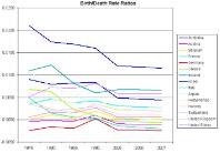
 Using these figures I graphed the trends for all fifteen countries (click the graph at right for a larger version).
What’s immediately noticeable is how much of an outlier Israel is. It has a substantially higher birth rate than the others, and a remarkably low death rate. The trend of its ratio is moving downward like the other countries, but it is much farther from reaching a stable or declining population than any other nation in the West.
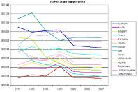
 The second graph shows the same group of countries, but without Israel (click the graph at right for a larger version). Removing the latter country allows the other trend lines to spread out, and makes it easier to see them.
There are five countries with a negative ratio, meaning that their population is in decline. Belgium has just reached the zero mark, and will presumably cross the line itself in the next few years. The United States is the only country currently showing an increase in the ratio.
Japan’s ratio has undergone a spectacular drop into the negative over the last three decades.
Several factors can contribute to a higher death rate, such as persistent warfare or civil insurrection, bad medical care, or a large proportion of elderly people in the population. The last condition probably accounts for some of the difference in death rates for Western countries. What else could explain why Australia’s death rate is so much lower than, say, Belgium’s? There is, of course, the possibility that countries with the most thoroughly socialized medical systems have inferior health care, and thus a higher death rate.
An aging population obviously also contributes to a lower birth rate. Add to that condition the disincentives to childbearing so readily provided by the welfare systems of Western countries, particularly in Europe, and one can see why the population in these countries is headed for decline.
I presume these statistics are drawn solely from citizens of the countries involved, leaving out any non-citizen residents. In some countries, such as Britain, citizenship is granted fairly quickly and readily to most immigrants, so that the birth rate must inevitably be skewed by the demographic proclivities of the new citizens.
I suspect that if there were a way to remove non-native citizens and their children and grandchildren from the figures, the trend for most of Europe would look very much like that of Japan, which allows almost no immigration.
The United States is undergoing its own demographic shift with the massive migration of Latin Americans across its southern borders. If the last three decades of this influx were removed, our trend line would not be so healthy, and would probably resemble Western Europe’s.
But all of these conclusions are speculative. I leave you with the raw data, the calculated figures, and the graphs. Make of them what you will.

6 comments:
This is a deceiptful matter. And statistics are the way of lying with maths.
If Unstead of counting the variation of the whole population you only count the variation of women of 15-35 class?
In my country the numbers are not so bad. very recently we had the biggest number ever in that class. This number is slowly drowning. The great drown of population expected for 2030/50 is by a good amount due to the decease of people born in 60/70s. it dosnt take much to stabilize the situation.
Most of the problem is in school. Many girls/young women (ex, my daughter) dont want to have children because she was taught at school about a catastrophic world that is coming.
What is interesting is to go to the CIA World Fact Book and look at the following nations birth rate:
Algeria, Tunisia, Turkey, and Iran.
ALL below replacement rate, at around 1.7.
Now, none of these nations can be considered very Western, or multicultural, or politically correct. They are not even Christian. And certainly don't have lots of teachings about the evils of marriage and childbirth for young women.
Yet they have the same pattern, i.e. vastly reduced birth rates. Along with other easily identifiable patterns such as increased income, and economic freedom for women.
Yes even Iran, which is repressive and Khomeni-ist, has greater economic freedom for women compared to under the Shah. They might be in burquas. But they have more ability to earn money on their own than in say, 1974.
Very likely, when women have the ability to defer marriage and childbirth, they will do so. This seems to happen in EVERY country that has even marginal raises in women's wealth and income that allows deferral.
What may we ask is the cause of the deferral?
The answer of course is simple: when women marry and have children they have huge "sunk costs" in economic terms on the marriage market. They can't "trade up" even in very Liberal western nations to a higher status man unless they are in the extreme edge of beauty.
In economic terms Women when they have the ability to do so rationally defer marriage and childbirth as long as possible to attract the highest status man as a mate and father to their children.
The flip side of this is that we will if we have improving economies for all nations/groups and/or no restrictions on women's ability to defer marriage and childbirth, see greatly reduced populations in exponential terms. Even in Muslim nations or poor Latin American nations.
Of course the short-run is likely to be fraught with violence world-wide as men violently compete for available women.
To whiskey_199
It is interesting compare these numbers (nations birth rates of Algeria, Tunisia, Turkey, and Iran) with those of Palestine or those of muslim imigrants in EU.
They are much higher, 3 or for in France and rocketing to 6 in Palestine.
What happens is that where they are feed by welfare or foreign countries (Palestine) they have highest rates than they have to work to raise their children.
It seems that we europeans must embarque in tax evading at all cost strategies to ruin welfare systems that are feeding the enemy.
We don't need more births (since the world is plenty crowded already) but fewer believers in Islam.
It is this intolerant and violent ideology that is the problem, not "declining" birthrates in the infidel world.
Mere demographic growth may only mean more chances for nature to spread pandemics.
As Aesop noted in his parable of the Lioness (not giving birth to great litters of offspring, but having only one or two children) who says: "But they are Lions!", it is quality, not quantity that matters.
To Profitsbeard
LIONS DONT KNOW DEMOCRACY!
"There is, of course, the possibility that countries with the most thoroughly socialized medical systems have inferior health care, and thus a higher death rate."
Thank you for saying that, Baron. If this were the MSM, I am sure we would have heard the opposite. They are almost always repeating the mantra that government-run healthcare is good.
Post a Comment