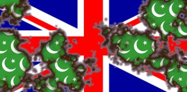
Unfortunately, this sort of thing is not representative of the zeitgeist. A young fellow named Nigel Turner has proposed a new Union Jack that includes new design elements to make it — you guessed it — more multicultural:

Rather than black, shouldn’t those new stripes be brown? And what about yellow? Will newcomers from China feel slighted?
And how about beige? My ethnicity’s skin tone is not represented in this flag — I’m offended and feel excluded on behalf of Englishmen of pallor.
Not to mention Martian immigrants, who may feel affronted by the complete lack of green in the design.
Here’s the story as reported by the Beeb:
Rebranding Puts Black Marks Against UK Flag- - - - - - - - -
Britain’s national flag — the union jack — has been given the makeover treatment, in the hope of reflecting a more modern society.
It’s become the marketing executive’s remedy for any organisation’s ills. From BT to BP, the Labour Party to the Lottery, hardly a business or institution has escaped the rebranding bug.
Now moves are afoot to redesign that most sacred of British hallmarks — the union flag.
A campaign is being launched to modernise the red, white and blue flag by adding a touch of black to reflect multicultural Britain in the 21st Century.
The proposed new flag (see above) is the work of Nigel Turner, an enthusiastic fan of the UK’s transformation into a multiracial society over the past 50 years.
Mr Turner, who has called his campaign Reflag, believes his plan would reclaim the union jack from its negative associations, and silence that old skinhead chant: “There ain’t no black in the union jack.”
“If I flew the union jack from a flagpole in my garden, many people would see it as a racist statement,” he says.
“I’m a glass half-full, rather than half-empty sort of person. It’s time we made a positive statement about the progression of a multicultural and multiracial society.”
[…]
Mr Turner, 46, who is white, hopes to spark a debate on the flag. He would like to see a new design replace the current union jack for the flag’s 400th anniversary in 2006.
“The proposed design does not mean throwing out all that has gone before, and it is clearly recognisable as the flag of the UK without saying something new.”
But as makeovers go, even a designer as thick-skinned as Laurence Llewelyn-Bowen would think twice about treading into such perilous territory.
The so-called “union black” has already raised the ire of the Scottish. Tuesday’s Scotsman newspaper said Mr Turner had “missed the point”.
“The United Kingdom is not a firm which changes its corporate branding each time the management alters. The flag is an enduring symbol of unity which transcends politics and absorbs cultural change.”
MSP Phil Gallie told the Scottish Parliament: “The suggestion that our flag should be redesigned is ridiculous tokenism and would do nothing to stamp out racism.”

Hat tip: Aeneas.

6 comments:
The Union Jack symbolises ancient Christian Britain. It is a combination of the crosses of the patron saints of England (St. George’s cross, red on a white field), Scotland (St. Andrew’s cross, white saltire on a blue field), and Ireland (St. Patrick’s cross, red saltire on a white field). Wales is not represented separately as England and Wales were one entity at the time the flag was designed. Adding a black cross and a black saltire would subvert the meaning of the flag. In my opinion it would be better to have no flag or even an alien, non-European flag than to transform the Union Jack in this way.
How do people like Mr. Turner sleep at night. One word sums up this man. JACKass.
The Union Jack, being the personal flag of QEII, and properly only flown where she is in residence, is a matter for the Garter King of Arms.
Mr. Turner appears to not have fully assimilated Englishness.
the way the black and red are laid out in radial symetry creates a visual spin that brings thoughts of a swastika.
Noah David Simon beat me to the post.
This bonehead who pretends to have designed a "multicultural" and "anti-racist" Union Jack has managed instead to do the opposite.
Introducing the black colour into the design, next to red and white, distinctly suggests a graphic similarity with the nazi flag, the Ku-Klux-Klan symbol and the flag of the Hungarian fascist party of the 1930's.
Political correctness hoist by its own petard.
I'm American, and I have a particular fondness for the British people.
For the life of me, I can't understand what the hubbub is about.
The Union Jack is a nice flag, and one that we patterned ours from.
I might just get a Union jack guitar just to piss off the PC Polizei running the place.
Post a Comment
All comments are subject to pre-approval by blog admins.
Gates of Vienna's rules about comments require that they be civil, temperate, on-topic, and show decorum. For more information, click here.
Users are asked to limit each comment to about 500 words. If you need to say more, leave a link to your own blog.
Also: long or off-topic comments may be posted on news feed threads.
To add a link in a comment, use this format:
<a href="http://mywebsite.com">My Title</a>
Please do not paste long URLs!
Note: Only a member of this blog may post a comment.